Mr. Sign
Pittsburgh, PA 15233
10 Reasons your Sign is Terrible
Signage is a powerful thing. Your business sign is the face of your brand, and each additional sign you create needs to represent your brand clearly and consistently. Don’t be a victim to terrible signage. Avoid these common signage mistakes in order to attract more customers to your business.
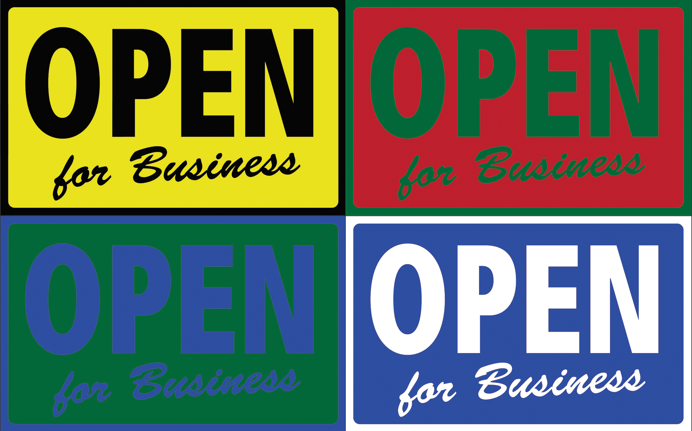
1. Poor Color Choices
Colors are a crucial part of your sign. Choose a couple of colors that fit with your brand. Be sure all of your colors are contrasting without clashing.
2. Low-Quality Art Work
Always start with clean, well-designed graphics. A high-quality logo that fits appropriately in your design can go a long way. Do not overlay font on graphics that may make your sign hard to read. Do not over-design your sign, keep it simple and remember that you need to communicate your message quickly.
3. Inappropriate Font
Choosing an appropriate font is another key element of your sign design. Use a couple of fonts that look great together, instead of cluttering your sign with several font styles. Never use Papyrus, Comic Sans or silly fonts of that nature.

4. Too Cluttered to Read
Always have your sign size in mind. Don’t make your font too large or clutter your sign with graphics. Negative space is just as important as your design elements when it comes to curb appeal.
5. Installed Wrong
It may seem simple but it is easy to invert one letter of your sign or get a bubble in your decal. Our best advice is; leave it to the professionals. If you are completing an installation on your own, be sure you know what you are doing before you get started and double-check everything before you install.
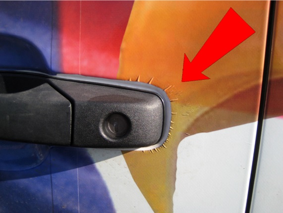
6. Wrong Material
Not all materials are created equally. Be sure your sign will stand up to whatever elements it may face. Don’t place an indoor banner on the front of your store expecting it not to be weathered or sun-faded. Choose the right tools for the job.

7. It’s Behind a Tree
Visibility is the top priority of any sign! Always choose a location for your signage that is going to allow maximum visibility. Do not create a sign that only reached a percentage of potential customers.

8. It is Sending the Wrong Message
Do not clutter your sign with several points, stick to one topic. Once you have chosen the message you are trying to convey, be sure your copy is correct. Always proofread several times before sending a sign to the printer. Grammar and spelling are simple errors that are sure to draw the wrong kind of attention.
9. Doesn’t Match your Brand
Be true to your brand. Choose colors, fonts, and graphics that best suit your business. Keep branding consistent throughout your signage. The purpose of a sign is to create brand recognition and that cannot be done when your image is disjointed.
10. Not Following City Ordinance
Obviously, before you go throwing a sign on your building you want to ensure that it meets all of the ordinances associated with your location. Don’t put time and effort in designing your sign just to have the city tear them down.
Start designing your new sign today!